By Liz Raiss
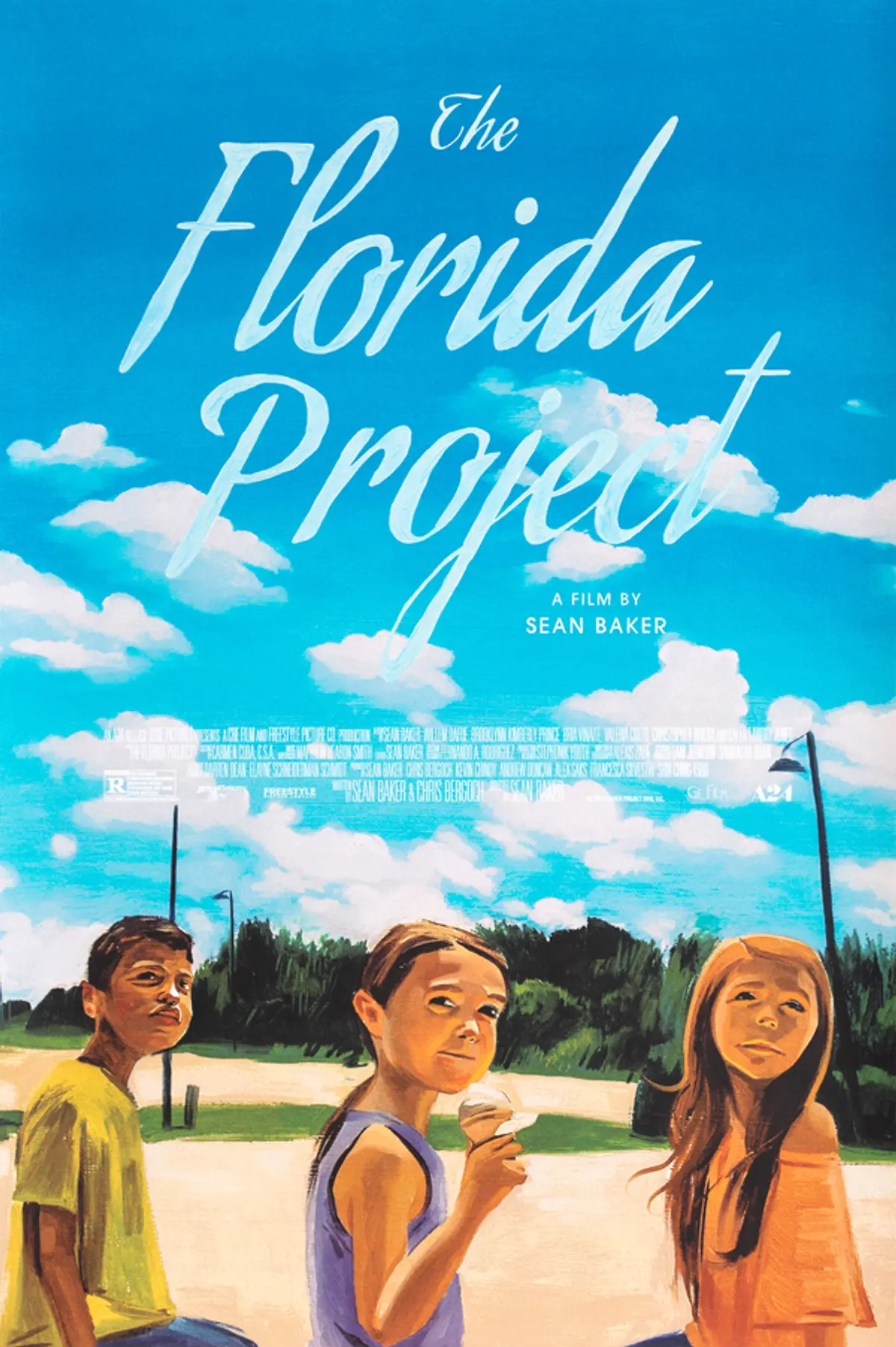
Earlier this year, A24 got in touch with Sam McKinniss, the 33-year-old painter whose luxuriant oil paintings lovingly refashion freeze frames of pop culture figures.
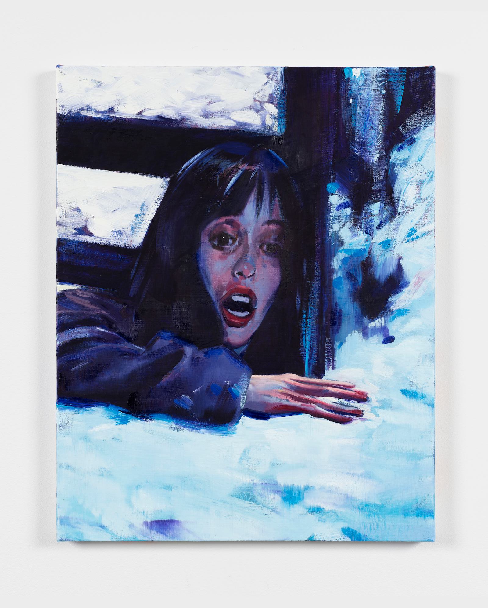
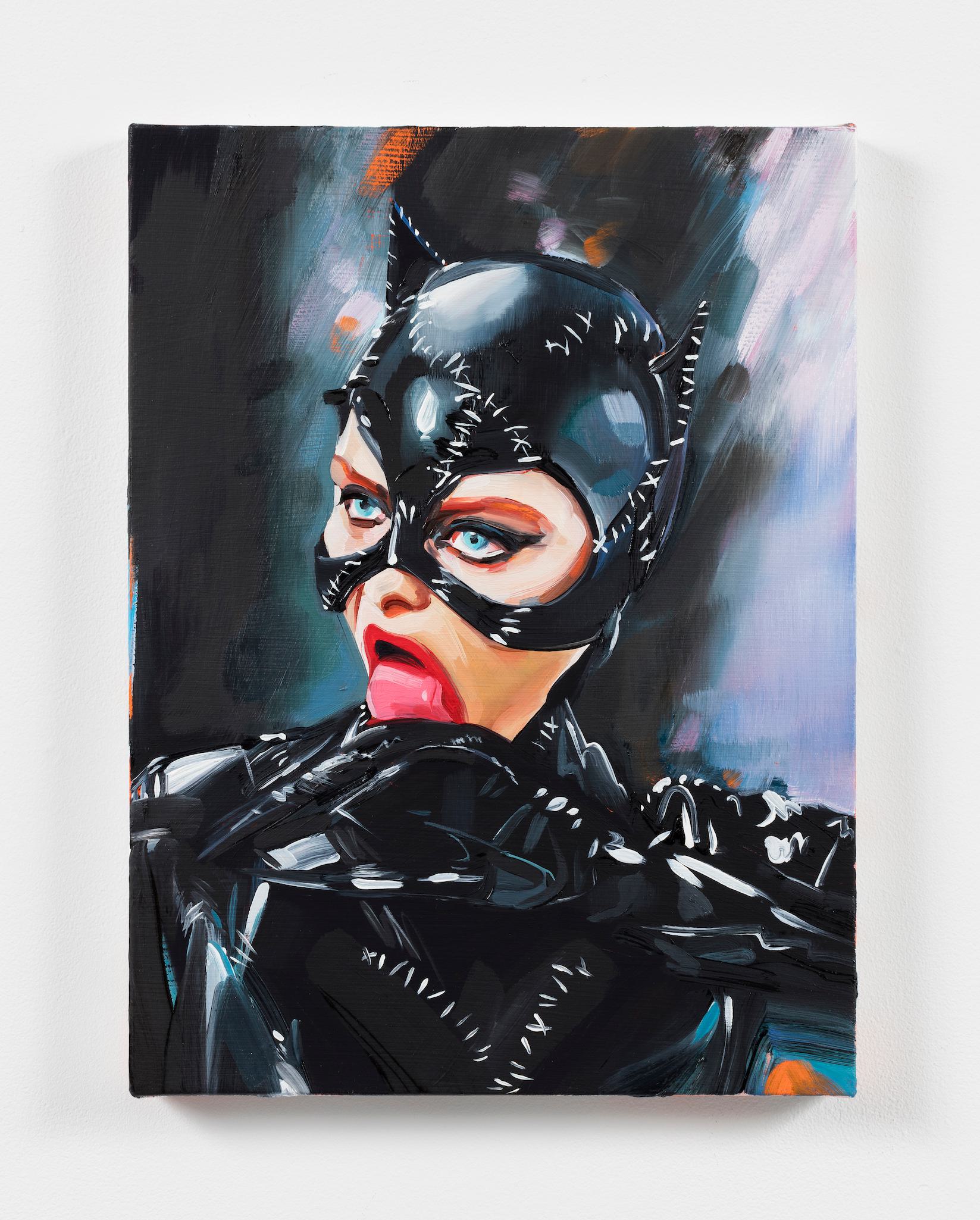
He’s painted Winona Ryder in Beetlejuice, A$AP Rocky and Lana Del Rey in the "National Anthem" video, Lorde bathed in blue light (a commission for the Melodrama album art). We asked him to reimagine a poster for The Florida Project, giving him free creative reign.
McKinniss searches Google Images for photos, film stills, and screen grabs of celebrity figures arrested in inanimate conflict, which he then expertly records in paint. While he toyed with film stills of Willem Dafoe as Bobby, a choice that would reflect his penchant for celebrity subjects, McKinniss ultimately landed on a promotional image of Brooklynn Prince, Valeria Cotto, and Christopher Rivera sharing an ice cream cone. It’s one of the first images that comes up when you Google the film, which is kind of the point. On the phone from Brooklyn, McKinniss explains, “I don’t have to search or invent the images that encapsulate the iconic moment or the spirit of the narrative conflict.” Rather than attempt to “stage moments with a similar kind of emotional resonance,” he relies on the visuals that stick with you, the kind that immediately flash when you think of a film, the ones that “still exist in [your] memory as a really impressive experience.”
The result of our collaboration with McKinniss is a captivating poster that speaks to his deep understanding of and affection for The Florida Project. The poster is now available to purchase in the A24 Shop, with proceeds benefiting The Refugee and Immigrant Center for Education and Legal Services (RAICES). Here, McKinniss breaks down the how and why behind the image.
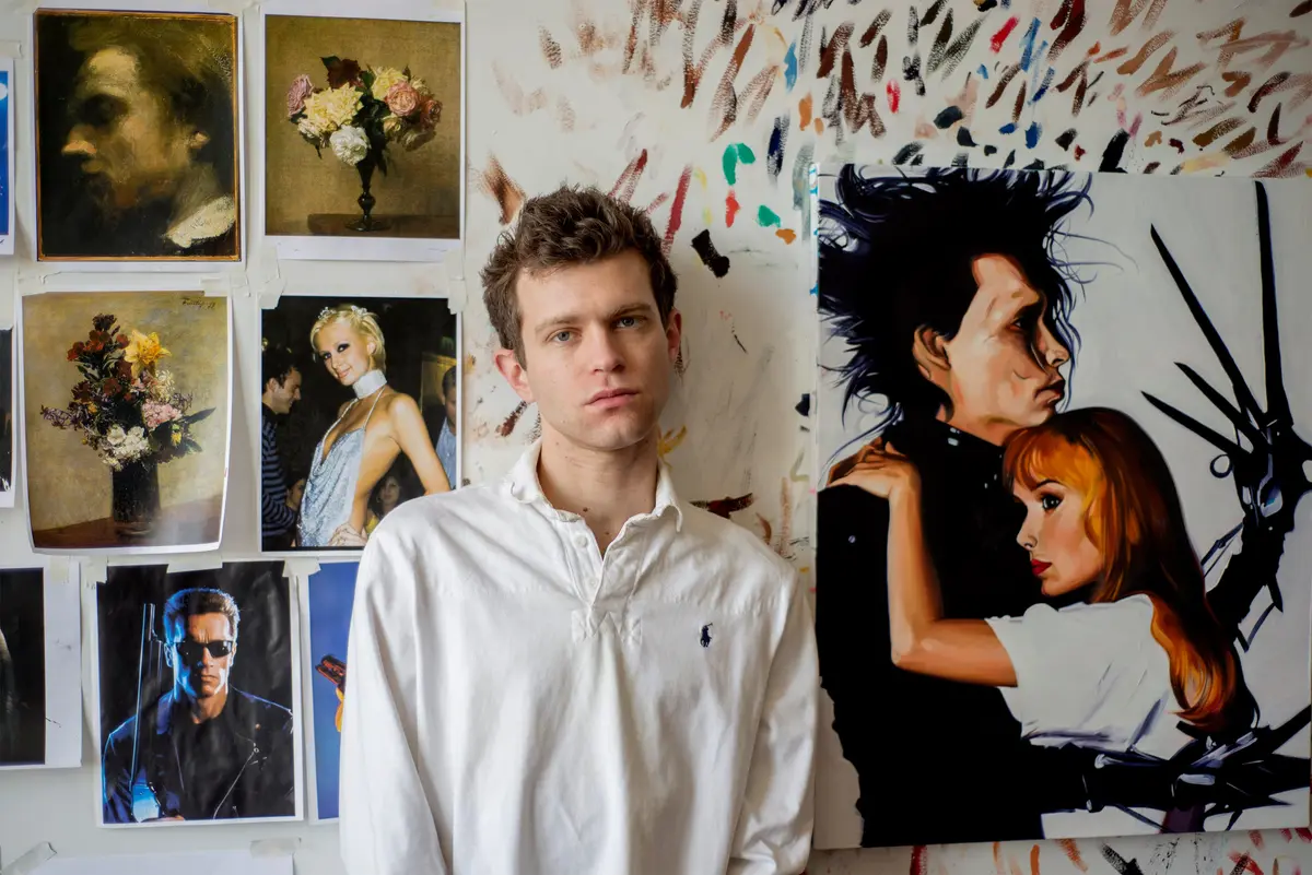
When did you start focusing on incorporating film and pop culture into your paintings?
When I went to art school I was drawn to making paintings of the figure. I was in life drawing classes and you just look, and you learn how to look and how to record what you're seeing with your hand. And that was very exciting to me and something that has always kind of turned me on.
I was inspired by artists who were using pop culture and bringing that into the personal artworks they were making. Artists like Elizabeth Peyton or Karen Kilimnik or Jack Pierson, who would paint, draw, or reference celebrities from popular culture and bring them into bodies of work that otherwise looked very autobiographical or diaristic. There's a generation of people before me that I was inspired by when I was very young.
And how did that translate into your own work?
When I first started making shows, I wanted to make really diaristic-looking work that recorded the people who were important to me from my own personal life. At some point in my 20s I was figuring out how to have an art career and make work that would let me engage with viewers who I don't know. I realized that I wanted my private life to be private and my personal life to be personal, and I didn't want to ask people who are important to me to model for my artwork anymore.
But I still wanted to think about the way people look, the way people style themselves, the way people present themselves: how lives or biographies are performed as images. And this was kind of coupled with the idea that I'm not a very good photographer, and I like working alone without a model.
It occurred to me that there's plenty of existing photography or film or movies or material that I can search and appropriate or borrow and then refashion for my own purposes to make new art. And using popular materials and figures from celebrity culture is an entry point for viewers to access or engage with my work.
What draws you to a particular image?
Drama. Conflict. Dramatic conflict, even if it's just represented in an image of a single person. I like images where the facial expression or body language or costume betrays conflict within the subject.
I like moments like that that are rich with that kind of drama. Actors are extremely good at communicating emotional reality in front of cameras because that's what they're trained to do. It has to do with talent and genius and awareness.
When did you first see The Florida Project?
I saw it in the theatre, not knowing anything about it or what to expect. I went with a friend who wanted to see it, and at the end we were both in tears. I was totally bowled over by it. I thought it was raw and inventive and a story extremely well told. The movie also impressed me as being very relevant storytelling and timely and difficult. It achieved a kind of narrative complexity that feels rare for Hollywood.
And then we reached out to you about the poster?
Normally, to be honest, commissions or commercial studio projects don’t interest me... But I thought about it for a little while and then I said yes, because it was my favorite movie of last year. And I was so impressed with [director] Sean Baker and the way it was made and the way it was acted. Commission work can sometimes feel like a chore, but this was the rare one where I felt like I could share my concerns as an artist with Sean Baker's movie.
I don't know how movies get made, but I do know how to respond to an important image.
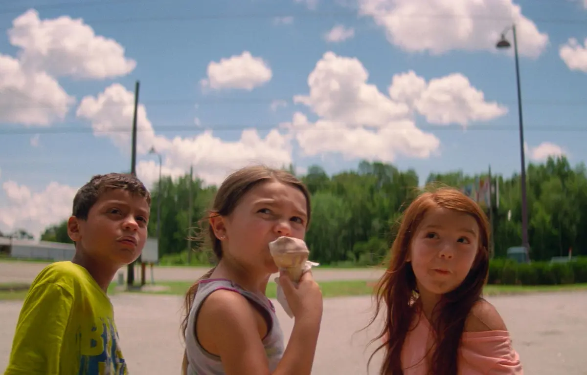
How did you land on that particular image of Moonee, Jancey, and Scooty?
That was the hardest part. After I agreed to do it, I watched the movie over and over again at home. The hardest part was identifying an image that I felt that I could translate with my hand and with my style that would also read as a poster. So I watched it and took screengrabs of the images that I thought look like paintings. I don't like to invent, I like all the inventiveness to be in the brush work and the strokes and the way the paint looks.
I eventually landed on a promotional image of the three child actors having an ice cream cone in a funny kind of parking lot area.
I started thinking about something that Sean Baker has said in some interviews: that this movie was a way for him to pay homage to The Little Rascals. That sort of resonated with me because it felt very true and was a very complicated inspiration to work into that post-recession economic reality of hidden homelessness and hidden poverty. And, weirdly, I was thinking about the famous image from the novel version of Les Misérables of Cosette sweeping by the illustrator Émile Bayard. I don't know how to explain that in classical terms, but those two reference points were on my mind when I finally settled on that image of the children.
Is there anything specific you’re trying to evoke in the poster’s viewers?
Basically watch the movie again, or if you haven’t seen it, watch it. I'm a fan of the movie so it's fun and exciting for me to participate with it a little bit. Movie making is really foreign to me, it seems above and beyond anything that I do. I don't know how movies get made, but I do know how to respond to an important image, and this movie tells a really powerful story.
This interview was edited and condensed for length and clarity.
